

Information – Theme, Character, Location, Narrative
Bright colours used to possibly indicate that the film maybe happy or upbeat. Towards the end of the sequence we see a male character with a suite on, possibly a city worker going to work o Christmas day. The design throughout the title opening sequence was graphically designed on a computer so no precise location was identified. However towards the end of the scene we see the character uptown.
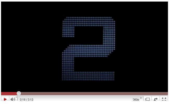
From the get go, with Saul bass use of bright colours and upbeat music, the audience are straight away informed that the film being watched is likely to be fast paced end to end stuff. With all the different colours that Saul bass expresses it indicates that it may possibly have a Christmas happy environment or a Vegas out going environments. For example The Hangover. There’s no mention of a character until the film starts but from what we saw it shows that it’s a male, possibly a city worker working uptown. Genre - Crime comedy A hybrid of crime and comedy films. Mafia comedies look at organized crime from a comical standpoint. Humor often comes from the incompetence of the criminals or dark comedy. Examples include Lock, Stock and Two Smoking Barrels, In Bruges, Fargo and Mafia Camera Work No camera work used but it was a graphic animated sequence.The use of animated sequence was effective. Saul bass used pixelated number and very bright lighting on the numbers that were appearing. This is very similar to the lights in Las Vegas. Saul bass cleverly did this to show and emphasize that the film was going to be about gambling or Las Vegas somehow. Mise-en-scene – Lighting, movement, figure, props, costume, colour, cinematography, Font, Type
|


0 comments:
Post a Comment